The Instagram team has stuck to the old retro camera icon and design for the past few years, but now it seems that they have redesigned their app and changed the way it looks. The new Instagram update has introduced a few new things: a new icon and also a refreshed UI design for the app and website.
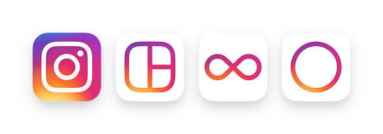
It is great to see that Instagram has decided to update their icon. The new icon seems to be updated with what seems to be a much more minimal design but with a rainbow gradient. It is quite colorful, but it’s probably the best that Instagram can do. Yes, they’ve updated it, but it does sort of seem rushed when looking at the design. For some it will take a bit to get used to, however for others, they’ll think that this icon is amazing and is much better than the old icon. In my opinion, the icon seems fine, but it would be better if they reconsidered the colors used. It is not just the Instagram icon I know, but at least they decided to update their whole suite of apps to match this design — that includes Instagram, Layout, Boomerang and Hyperlapse.
As for the design of the app, most of the UI have been changed in color to just black and white. With this new black and white color scheme, people can focus on the pictures without being distracted by the app itself. There are still colors with the red notification bubble and the red heart to like photos that you normally see from Instagram.
![]()
This new update does take a bit of getting used to, especially in my mind, but I do think that the app redesign is much better than it was. As for the new icon though, I wouldn’t think of it as the greatest design, but I’m pretty sure that it really doesn’t matter. It also seems that many Android and iOS users have been receiving the update and if you have not received the update, then do not worry as you will get it sometime very soon. Do you think the old or new design/icon is better? Leave a comment with your thoughts.